ggplot에서 두개의 y축을 사용하는 방법이다.오랫동안 불가능하다고 생각했던 기능인데 의외로 2016년 부터 지원되었던 것 같다.
PKPDdatasets::sd_iv_rich_pkpd 데이타를 사용해서 살펴보았다.
전체 그림
library(tidyverse)
library(PKPDdatasets) # devtools::install_github("dpastoor/PKPDdatasets")

# import data
obs <- PKPDdatasets::sd_iv_rich_pkpd %>% as_tibble()

# show first observations
head(obs)
## # A tibble: 6 x 10
## ID TIME COBS EOBS WEIGHT AGE DOSE SEX RACE AMT
## <int> <dbl> <dbl> <dbl> <dbl> <dbl> <int> <chr> <chr> <int>
## 1 1 0 0.250 1.43 57.1 50.1 1 Female AfricanAmerican 1
## 2 1 0.5 0.224 0.995 57.1 50.1 1 Female AfricanAmerican 0
## 3 1 1 0.187 0.525 57.1 50.1 1 Female AfricanAmerican 0
## 4 1 2 0.172 0.509 57.1 50.1 1 Female AfricanAmerican 0
## 5 1 4 0.116 0.391 57.1 50.1 1 Female AfricanAmerican 0
## 6 1 6 0.0682 0.225 57.1 50.1 1 Female AfricanAmerican 0# plot PK
p <- ggplot(obs, aes(x = TIME, group = ID)) +
geom_line(aes(y = COBS, color = 'PK')) +
labs(y = "Concentration (PK) or Effect (PD)",
x = "Time (h)",
colour = "Parameter") +
theme_light()
# add PD
p <- p + geom_line(aes(y = EOBS, color = 'PD'))
p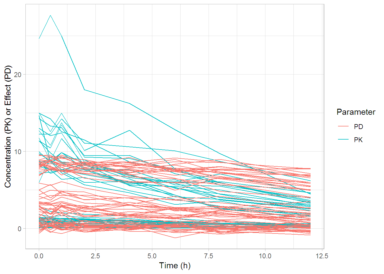
대략 PK 값의 최대치 (~28) 가 PD 값의 최대치 (~9) 보다 3배 정도 높아보인다.
p2 <- ggplot(obs, aes(x = TIME, group = ID)) +
  geom_line(aes(y = COBS, colour = "PK"))

# adding the relative PD data, transformed to match roughly the range of PK
p2 <- p2 + geom_line(aes(y = EOBS*3, colour = "PD"))

# now adding the secondary axis, following the example in the help file ?scale_y_continuous
# and, very important, reverting the above transformation
p2 <- p2 + scale_y_continuous(sec.axis = sec_axis(~./3, name = "Effect (PD)"))

# modifying colours and theme options
p2 <- p2 +
  #scale_colour_manual(values = c("blue", "red")) +
  labs(y = "Concentration (PK)",
       x = "Time (h)",
       colour = "Parameter") +
  theme_light()
  #theme(legend.position = c(0.85, 0.85))
p2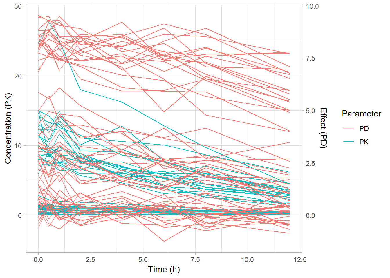
왼쪽에는 PK, 오른쪽에는 PD가 표시되어 있다. 큰 차이가 없어보이긴 한다. 그렇지만 PK와 PD의 값 범위가 크게 차이나면 이렇게 그려주는 것이 의미 있는 해석을 이끌어 낼 수도 있다.
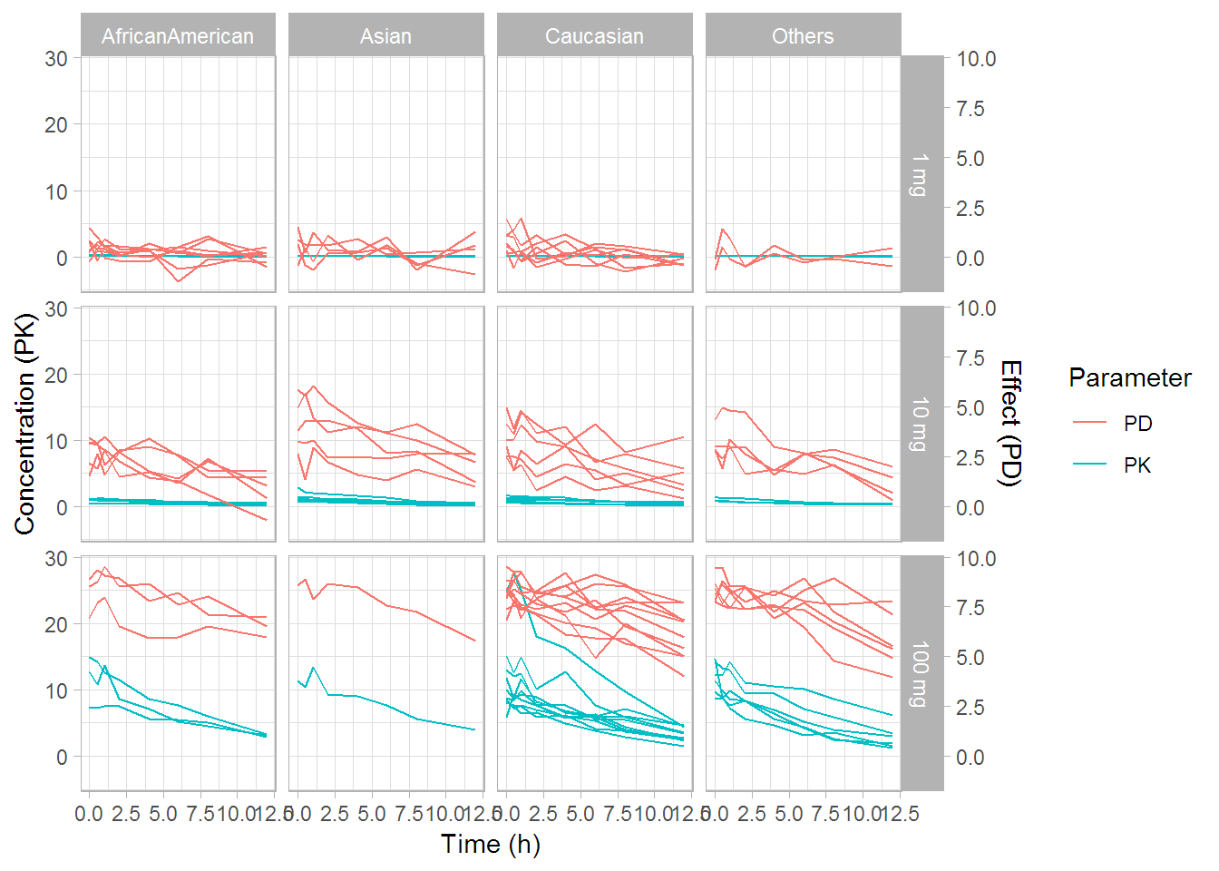
개인별 그림
투약 용량과 인종별로 facet을 구성해서 그려보았다.
p +
  facet_grid(paste(DOSE, 'mg') ~ RACE)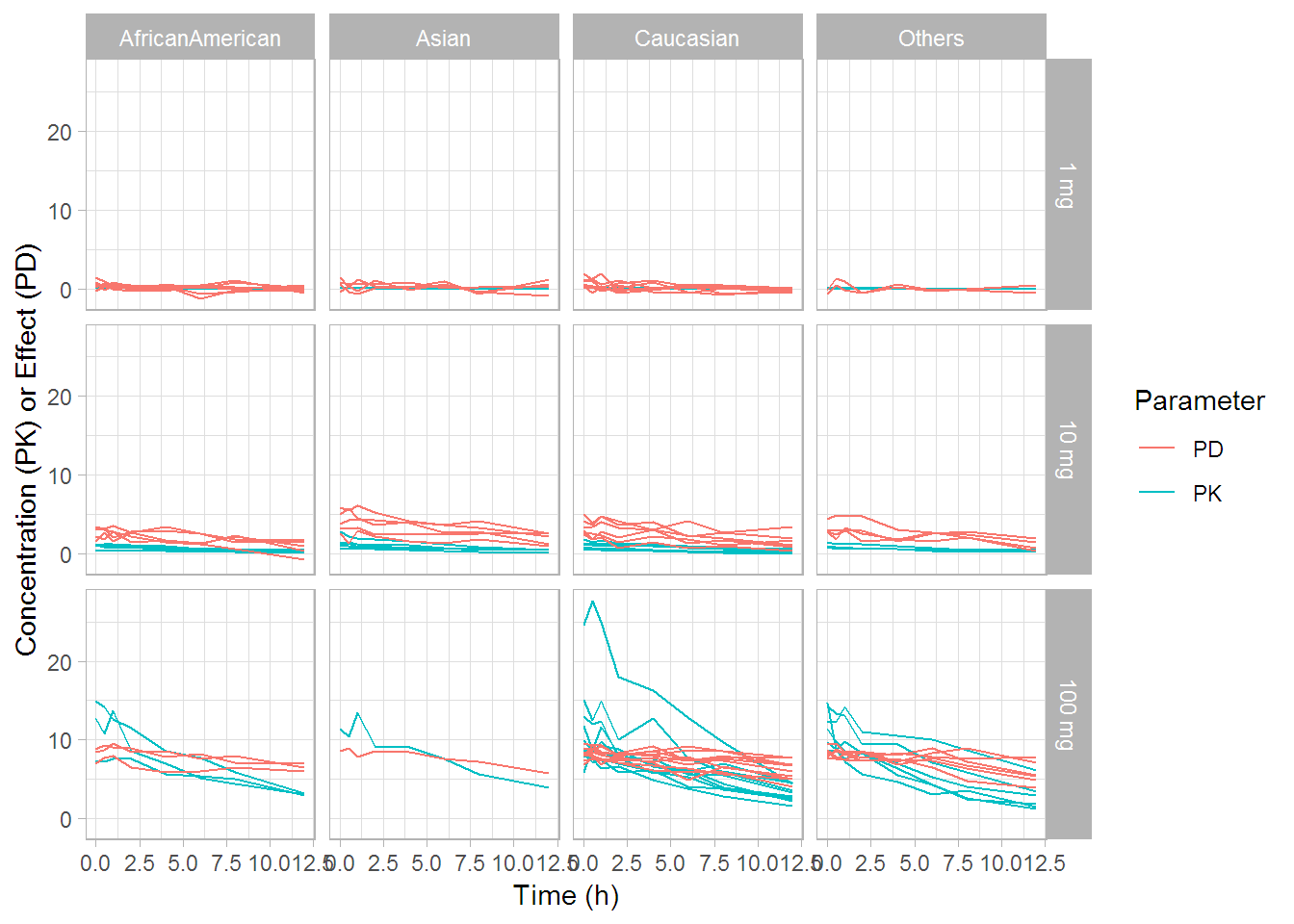
p2 +
  facet_grid(paste(DOSE, 'mg') ~ RACE)